
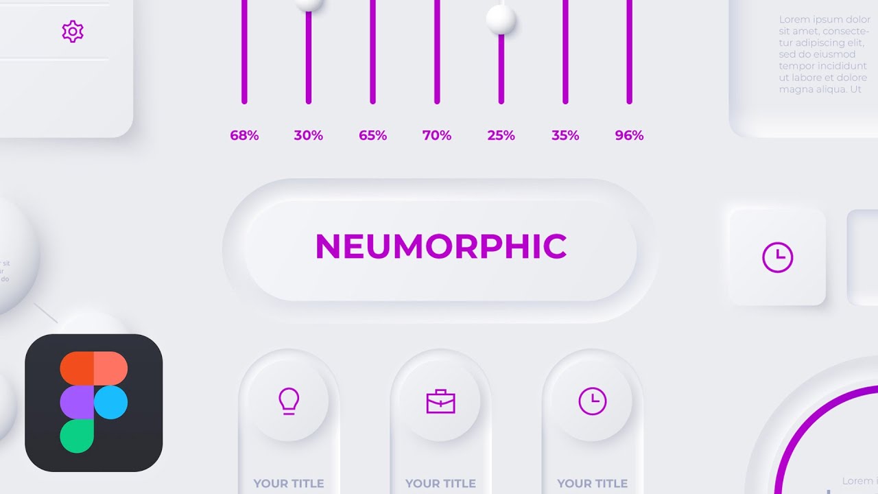
In addition to minimalism, neumorphism adds a sense of three dimensions through the use of buttons and other components. Neumorphic elements have raised shapes that are typically formed of materials that are very similar to the backdrop, and they sit directly on top of the background surface. The element’s color contrasts somewhat with the background surface, or it is the same color.
The Origins of Neumorphic Design
The Macintosh, introduced by Apple in 1984, was the first personal computer to use a graphical user interface. Steve Jobs, one of the co-founders of Apple, thought that common icons and symbols, such a trash can or a folder, would make the Macintosh interface easier for newcomers to learn how to use. After leaving Apple in 1985, Jobs returned in 1997 and changed the company’s user interface (UI) to skeuomorphism, a design approach where interface elements are identical to their real-world counterparts in every way. Apple created a complete skeuomorphic system called Aqua, a water-themed design language with shimmering buttons, drop-down menus, and icons, by the time Mac OS X was released in 2001.
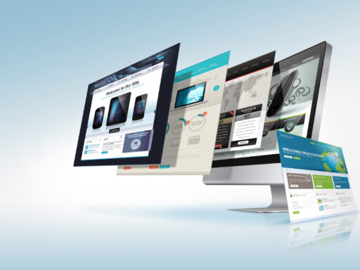
After the iPhone debuted in 2007, Apple’s skeuomorphism became considerably more realistic. Skeuomorphic design had become the standard for digital interfaces by the early 2010s. However, as society grew increasingly dependent on mobile devices, skeuomorphism’s limitations became apparent: making skeuomorphic design elements takes a lot of time and technical skill. Furthermore, when skeuomorphic elements are resized to smaller sizes, their finer features tend to be lost, even though they looked fantastic on desktops and home screens.
In sharp contrast to the realistic gradients and textures of skeuomorphism, flat design—a digital-era revival of 1960s minimalism—saw broad appeal in the mid-2010s. Large corporations trying to organize their design languages found flat design to be a rapid and extremely flexible style that stripped interface components of everything except their most essential elements: color, form, and line.
In sharp contrast to the realistic gradients and textures of skeuomorphism, flat design—a digital-era revival of 1960s minimalism—saw broad appeal in the mid-2010s. Large corporations trying to organize their design languages found flat design to be a rapid and extremely flexible style that stripped interface components of everything except their most essential elements: color, form, and line.
Neumorphism vs. Material Design
The idea of elements being on top of each other is utilized by both the neumorphic design and the material. That concept is implemented differently in the two design methods, though. Neumorphic and material design elements are layered on top of one another.
Material components appear to float on the background surface thanks to the assistance of a single shadow. It appears as though the element is detached from the background surface.
Neumorphic components are positioned directly above the background surface. Usually constructed from a material that closely resembles the background, they are elevated shapes. The element’s color contrasts somewhat with the background surface, or it is the same color.
How To Create a Neumorphic Effect?
- You begin with a simple shape, such as a circle, square, rectangle, rounded rectangle, etc.
- Ensure that the fill color of the shape matches the backdrop color.
- Provide a pair of shadow shades. There is a single, nearly black outer shadow on the right and bottom, and a lighter outer shadow on the left and top, respectively.
- There’s an element on your digital surface that appears to be sticking out. To accomplish the exact opposite, i.e., to make something appear etched inside, create interior shadows rather than exterior ones, and flip the colors.
Will it replace flat design style?
Neumorphism adds noise to an element that doesn’t need it, so even if it’s in right now, I don’t think it will replace flat or material design anytime soon. In addition, I believe that minimalism is becoming more and more popular in design.
A superpower however for designers
Although there aren’t many neumorphic components in popular websites and apps, designers have been able to use them in a wide range of contexts.